
Project Brief
An exploration in the growing trend of THC depency in the american population.
In-depth user research and data driven design that seeks to provide both a sense of community, as well as a reliable health tool to a rising user base
My Roles
Diving into the Research
Discovering the Problem
Marples, Megan. “Legalizing Recreational Cannabis Increases Its Use, Research Shows.” CNN, 29 Aug. 2022
Noticing an Emerging Trend
Slowly at first, and then all at once, coworkers, friends and peers began to slip into daily marijuana use. Over time, I realized that this phenomenon may be indicative of a larger issue and began to look deeper. I wanted to understand why this may be happening and looked through government reporting and recent journalism only to find that the trend was well documented, with sources like CNN reporting an almost 24% usage increase in states that had recently legalized recreational marijuana.

Population Research Reveals More Insights
Findings from collected CDC population studies reported that 18% of the american population consumes THC products, and of the 48.2 million people that the statistic covers, approximately 30% have marijuana use disorder. Further work done by the Mayo Clinic also found reliable correlations between this disorder and other mental health conditions like generalized depression and anxiety, which are also on the rise.
Not only was a large demographic susceptible to developing a substance use disorder, they were simultaneously dealing with conditions known for their socially isolating nature. This prompted me to begin brainstorming a reliable and effective tool that could motivate and support users along their journey to sobriety. I felt I could provide this through a mobile application.

approximately 30% of people who use marijuana have a marijuana use disorder
Interviews
Finding Participants
Before I could start attacking the problem, I wanted to understand the users I would reach. The first step was sitting down and collecting their insights and experiences. User surveys like the one depicted helped filter out interviewees from the general public. I wanted to be intentional with the participants I chose so I sorted through reddit forums, personal relationships, and instagram, screening for a personal experience with dependency.


Scripting and Conducting Interviews
The script aimed to not only understand each users relationship with marijuana, but also who they were as a person, in order to get a full picture of the target demographic and inform my future UI and UX decisions. Interviewees were prompted to share insights regarding their introduction to marijuana through their current struggles with the dependency. Each interview lasted roughly 20/30 minutes, and proved to be an exercise in resisting leading questions. I found I wanted to lead the participants to a conclusion regarding their relationship with dependence and made an active effort to resist the urge.


Empathizing and Catagorizing
Sorting for Trends
I took the interview notes and personas that I collected and distilled them into affinity maps. The goal was to identify main points of interest, that may help create a narrative I could work from. Sorting them on post-it notes helped in finding patterns that I could use to inform future design choices. By the end themes like "satisfying a compulsion", "soothing anxiety", "and "seeking relaxation" began to form clusters. Below is a cluster of insights grouped by the them of " Tolernce Breaks and Social Temptation"


Persona's Help Outline the Main Demographics
Creating Personas helped to condense complicated and diverse perspectives into demographics with goals and desires that the application could cater to. The users fit one of three groups. Daily-use users, who were actively seeking sobriety, occasional users who felt they could use the application for drug testing and short term sobriety goals, and those who saw no reason to change their relationship with marijuana and wouldn't use the application

Daily Users
Occasional Users

No Change Users

The personas helped to narrow down my target demographic for the application and begin looking for underlying trends within both the Daily Use and Occasional Use groups. Four main ideas emerged, and would inform the mapping and sketching phases further on:
-
Users expressed a deep desire to let go of their dependency
-
They found themselves unable to maintain the motivation or support necessary to sustain the change
-
Periods of successful distance from the substance happened when users paired up to quit together
-
Users needed somewhere to vent their frustrations, talk about setbacks, and feel seen
Users also demonstrated a hesitation towards support groups and meeting centers as they seemed too drastic. There was a cognitive dissonance between the understanding of the severity of the dependance, and the socially acceptable nature of marijuana. Users wanted to break the cycle on their own terms

Translating Insights Into Solutions
Social temptations
It became clear that the application needed to curb social temptations, as they presented as the number one frustration in interviews.
Early in development, the idea of an "Updates" function, where users could share their frustrations and fall-backs with friends and suppporters, took shape. Hearing that users were most successful in their tolerance breaks when done in groups led me to conclude that some sort of "Sponsors" section was important as well, and would elevate the application passed a simple timer. It was decided that Awake would function best with small groups of friends or family, showing support for each-other through a medium that rewarded success instead of tempting relapse.
Insight
Users who have a friend or roommate who are also taking a break, felt that the companionship helped in staying consistent
Design Question
How do I create a homepage that prompts users to connect ,and elicits the feeling of solidarity

1
2
3
Design Solutions
1
2
3
Post update button highlighted in visual hierarchy
Updates Tab made easy to navigate to from home page
Notifications tab visible from home page
Insight
Users expressed shame while discussing points of weakness and breaks in sobriety
Design Question
How do I reinforce and celebrate successes over failures in both the design and tone of the text used

3
2
1
Design Solutions
1
2
3
Invoke appreciation and pride in the opening text
Hopeful guiding text to lead into a new day one
Save function to create a physical reward for the time spent sober
'Tolerance Break’ structure
The key differences between marijuana addiction and other types of dependency became clear as well.
The idea of a Tolerance or T-break, came up multiple times. There would also need to be a short term goal function to cater to this. This need for short term sobriety tracking would be met by designing the central timer to have customizable versions for long and short term goals. This function not only separates Awake from the competitor capabilities but showcases its dedication to undertanding the needs of its users
Early Sketching
User Flows
With my user insights collected and sorted, I moved into creating user flows to map out how a user may want to navigate the application, and which aspects were the most important. This was supplemented by preliminary sketching to help visualize the screens as they were forming. Each page was also site mapped in order to cater to user-flows and spot friction areas. For example, user research revealed that being able to navigate to their community page was of high importance, and was implemented into the home page as a single scroll as a result


The most difficult aspect of the sketching phase was the home page design. Early iterations proved to be cluttered and not visually appealing. The cramming of multiple elements into one screen went against the goal of creating an aplication that felt clean and healthy.

Wireframing
Low Fidelity Wireframes
Wireframes helped to propose layout designs and workshop usability for the ideas that took shape in the sketching phase.


User Testing with Lo-Fi Wireframes
Testing the wireframes with users helped to locate friction points that would have gone unnoticed otherwise.
Among other changes, the original 'sobriety tracking' visualization function was received as confusing and users did not feel rewarded. This let to several iterations of the central timer.

Heard in Testing
"The timer method feels unintuitive and doesn't depict the passing of time in a satisfying way"
Design Solution
Utilize an accent color and create a clock interface with a loading bar. Draw the users eyes to their progress first

Designing The Look
Design System
Once the skeleton of the mobile site was finalized it became time to implement color and unify the button and text styles
Inspiration was pulled from existing healthcare applications and nature photography that I felt invoked the sense of security and trust that a sobriety application needs. The color Blue Sapphire managed to balance a calm and professional aesthetic, while Opera Mauve provides a highlight color to draw attention to important aspects of the UI

The Font
Lato Regular was chosen in order to be easily legible yet distinctive

Key Frames
Onboarding
Users are guided through the set-up of their account and the connection to their chosen sponsors


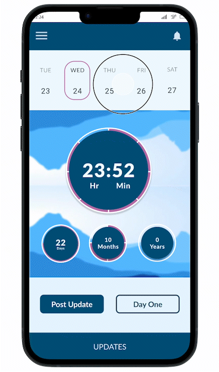
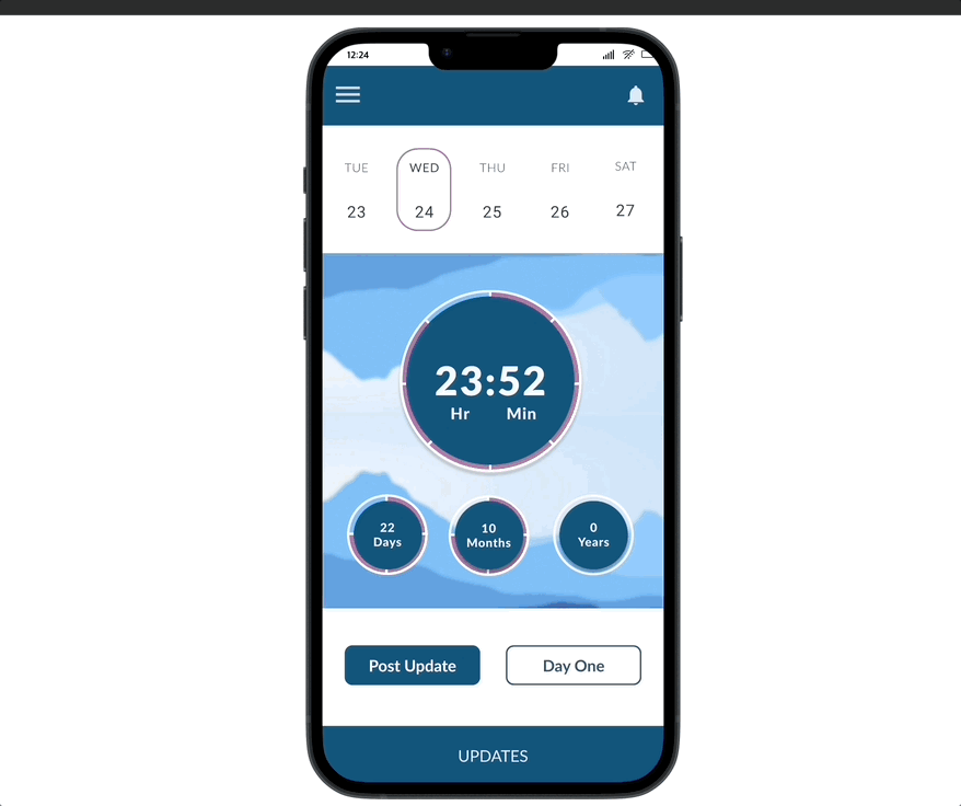
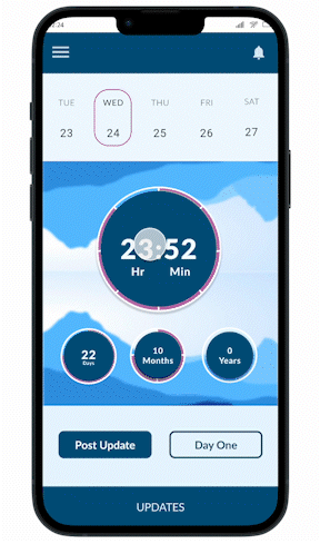
Clock and Calendar Style Visualization
Users are able to see their current sobriety since last relapse, but also are able to open calendar view to see all setbacks during the month


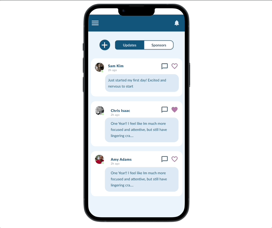
Posting an Update
When users are feeling discouraged and in need of support, or excited and hoping to announce a successful sobriety break, they are able to post updates to their feed
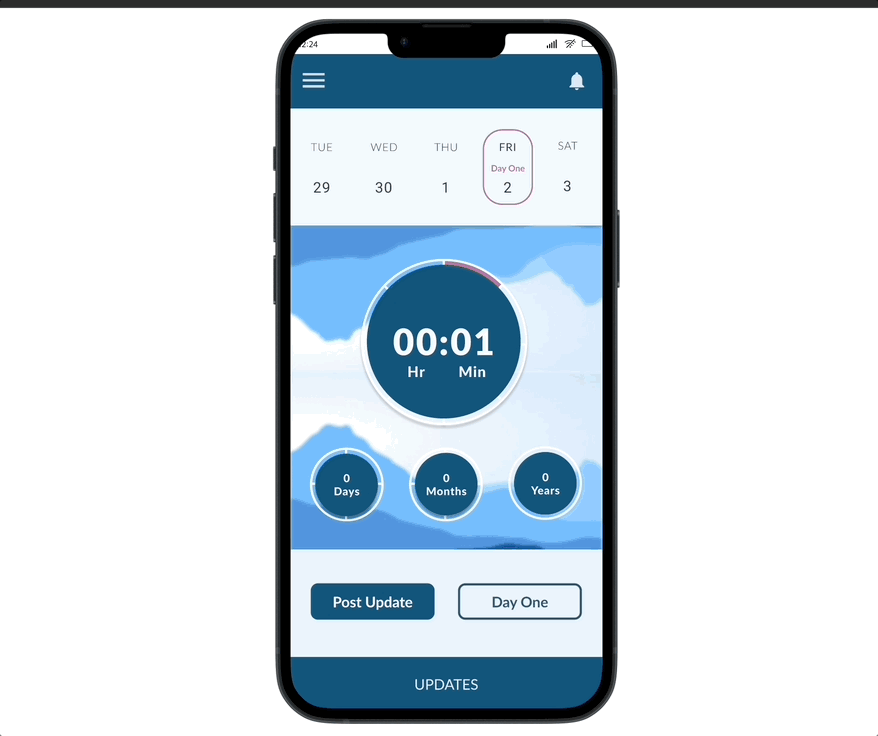


New Day One Card
Users who reach their goals or have a relapse are able to save their progress and be rewarded for the time spent sober. This card can be saved to photos or shared with other sponsors


View and Interact with Other Updates
Users are able to see their sponsors updates and comment or leave a reaction to show support


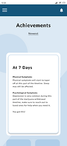
Interactive Achievements for Milestones
Achievements are awarded to users as cards that display pertinent information regarding the symptoms and physiological responses that come with said amount of days sober.


Takeaways from the Process
An Introduction to the Process of User Research and Design
This project provided invaluable as an experience. One of the biggest takeaways was the ability to see how important understanding the user is to the end product. I found myself fighting the urge to dive into the design process before developing the user profiles, which slowed me down initially. Furthermore, the interviews pushed me to utilize a whole new skill set. Using social and research skills I had to try and make users feel comfortable and safe enough to discuss an otherwise personal matter as it was essential to creating the best possible product.
Constraints
Working on a schedule meant that every step of the process had limited time for ideation and I felt that was reflected in the final product. I had to remind myself that delivering a prototype on time was just as important as the prototype itself, and strove to find the balance between the project timeline and my desire to add all the features I wanted to to the prototype. If given the chance I would dive even deeper and re-iterate to add designs that excited me during user testing sessions. The ability to customize and edit the display of the timer, more ways to celebrate goals and the ability to save and post those awards was put on the back burner.