
The Problem
Physicians send and receive a large quantity of important and sensitive patient information daily, but still collaborate via outdated handwritten communications
This is slow, unreliable, and dangerous
I built and documented 10 new features that consolidated hospital collaboration and eased the daily cognitive load of physicians
Timeline
6 Months
Collaborators
3 Designers
Product Team
Dev Team
Tools
Figma
Axure
Jira
The Platform
MobileHeartbeat stepped in to handle everything from shift scheduling, EHR access, messaging, and a variety of other day-to-day physician needs
The mobile and desktop platform served as an easily accessible and HIPPA compliant solution


The Impact
We actively reduced the need for multiple pagers and devices during shifts and reduced overall unit noise in 200+ hospitals


A Key Feature
The Quick Broadcast
User research informed us that
quickly broadcasting hospital alert codes from the platform was an essential feature
I would build and iterate on this feature in Figma and document it in Axure for development handoff


Feature Highlights
Broadcast urgent information without friction
Add vital patient and location information
Reach your audience without adding noise to the hospital enviroment

Iterative Design Process
An essential part of my skillset was quick yet thoughtful iteration
Incorporating feedback from the rest of the UX team at every stage made for a better end product
First Test
Second Test
Final Design


New Insight/Idea
New Insight/Idea
Early Iteration
Using existing visual
language and positioning necessary elements for the feature
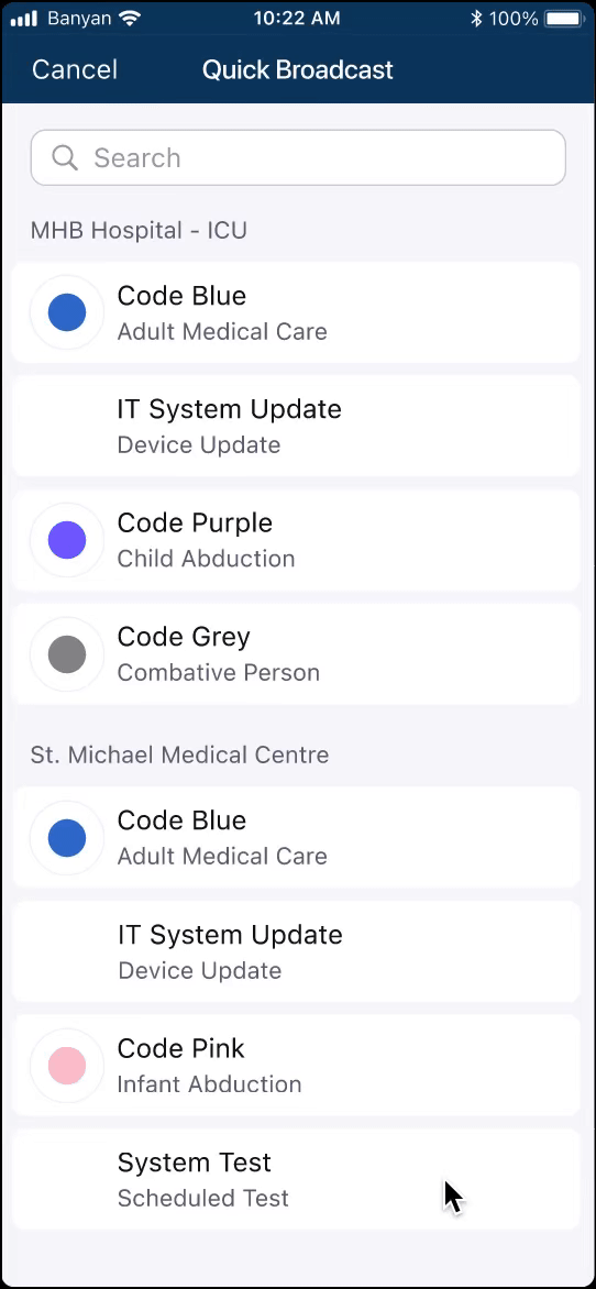
We knew physicians were more likely to broadcast about their assigned patients, so we took patient filtering methods from the Directory were repurposed into the patient select screen to reduce friction
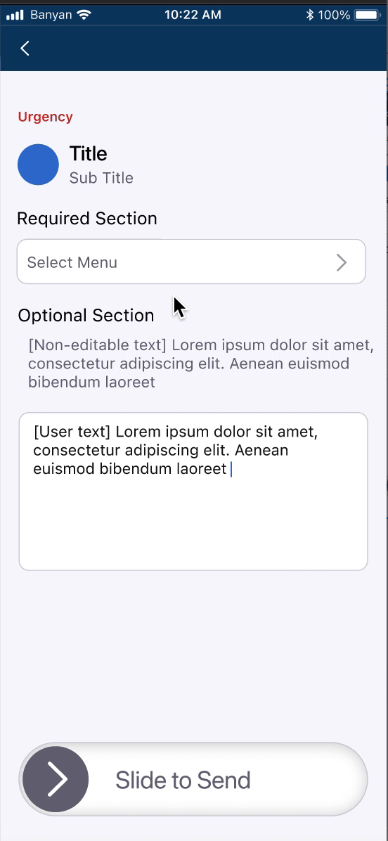
We also knew that an accidental send would be unsafe and incorporated a 'slide to send' button to make sure users were intentional in their broadcasting


Second Iteration
Increasing the 'speed of send' and catering to edge cases
Adding search to the code select menu helped eliminate extra seconds off the completed send time
Adding section headers with facility labels accounted for our users who work in multiple facilities with different codes

.png)
Systematic changes are tested with the team as well as against the originally stated needs of the feature
Users need a way to add additional content to their broadcasts to ensure physicians receiving the alert have all the necessary details.
This meant testing content boxes as well as accounting for overflow text input and other standard UI practices


Final Touches
Iterating can be a nonstop process.
Working within the project interval timeline was just as important as a 'perfect' design
Feedback
Users constructing a broadcast should be more aware of where it will be sent. The user should also be allowed hyper-specificity when detailing where an emergency is occurring
Change
Location info is moved to the top of the visual hierarchy and
location specifier is changed to a free-text box to allow personalized inputs
Feedback
Users should not be slowed down because of a skipped required field, and should be made aware of the urgency of the broadcast they are about to send
Change
An asterisk indication on required fields to reduce friction before sending, and the utilization of a ‘tokenized’ red on the slider clearly indicates urgency
Once the design hit the feature requirements and was sufficiently quick to send. We met with the product and dev teams to finalize the product

Setting the Scene
Timeline
6 Months
Collaborators
3 Designers
Product Team
Engineering Team
Tools
Figma, Axure, Jira